Pareto chart analysis is statistical methodology to prioritize any task from number of activities that may produce significant overall effect. It is also calls 80/20 rule – Mean focus on 20% prioritized works may give you 80% of the benefits.
Actually there is even a mathematical expression for it, which known as the 80/20 rule. States that 80% of all issues occurrences are due to only 20% of the issues encountered.
Example:
If you are engaged with manufacturing steel tubes business, and with your manufacturing unit have some material issues in production line such as:
- Material Rapture – 30
- Material Pitting – 25
- Straightening marking – 18
- Dent on steel tubes – 15
- Excess Thickness – 9
- OD scoring – 3
Now, you can use the Cumulative % for prioritize the issues for solve in order to maximum solutions with minimum effort. To solve the issue, you have to use the Pareto chart analysis in excel.
What preparation require before Pareto chart analysis?
Creating a Pareto chart with excel is very easy if you take care some steps before the making a Pareto chart from your collected data. Here are some steps that may help you to preparing Pareto chart in the excel sheet:
- First of all, you have to identify the information which are used for the Pareto chart. Choose an issues that require to be addressed.
- You have to make sure, what information are useful for the Pareto chart, mean what will be measurements and scale you can use to point out the issues on board.
- You have to list out the causes of the issues by brainstorming from existing information.
- Normally at the stage of the monitoring, you have to decide on how these issues causes will be monitored for the information for chart. Such as costs, frequency of occurrences etc.
- Decide time frame. You have to make sure duration & time frame of the information you will use for. Meaningful information will be gives a best possible results.
- Categorize the issues, understand what time scale will be highly suitable for issues. Even the frequency may be varying accuracy of results.
- Organize each issue in tabular formation is much better for understand the issues in line with creating a Pareto chart.
These points may help you to manage the information in the line with accurate analysis through Pareto chart. Preparation is very important because the outcomes from the analysis will be appreciate important for eliminate issues. In case of the inaccurate information can mislead the solutions.
How to create Pareto chart analysis in excel?
As you see in preparation of Pareto chart analysis in excel section, you need to prepare the information which are require to build the Chart. Usually, in the preparation section, you have to identify and setup the data which you are going to use in the Pareto chart. Simply, we will use following information as example:
As above in example, we imagined the issues in a manufacturing product of steel tubes in a manufacturing unit. During the processing, following issues are coming with raw materials or semi-product in production lines. Issues with product / raw materials are as below:
- Material Rapture – 30
- Material Pitting – 25
- Straightening marking – 18
- Dent on steel tubes – 15
- Excess Thickness – 9
- OD scoring – 3
Now, we have to require to identify proper solution for these issues are raising with materials. First of you have to understand what details or steps you need to organize it.
Organize the data
First of all, you have to organize the issues data with tabular formation. Constructing a Pareto chart for selected issues require an identifying percentages or each one. For each Issue you have to calculate it. Later on, identify Cumulative % for each issue, formulation for Cumulative % are:
Cumulative % for Issue 2 = Issue 1 Cumulative % + Issue 2 %
Cumulative % for Issue 3 = Issue 2 Cumulative % + Issue 3 %
See example in table format:
| IN-PROCESS ISSUES WITH PRODUCT / R.M | COUNT | % | CUMULATIVE % |
|---|---|---|---|
| OD scoring | 3 | 3% | 3% |
| Excess Thickness | 9 | 9% | 12% |
| Dent on steel tubes | 15 | 15% | 27% |
| Straightening marking | 18 | 18% | 45% |
| Material Pitting | 25 | 25% | 70% |
| Material Rapture | 30 | 30% | 100% |
| Total | 100 |
Creating a Pareto chart
For creating a Pareto chart in excel, you have to first select the data from the tabular sheet. You have to select issues, Percentages and Cumulative % for chart.
Select from the insert menu >> Select Histogram Chart >> There are you have to select Pareto chart.
Now, your chart is ready, you have seen the example as below:
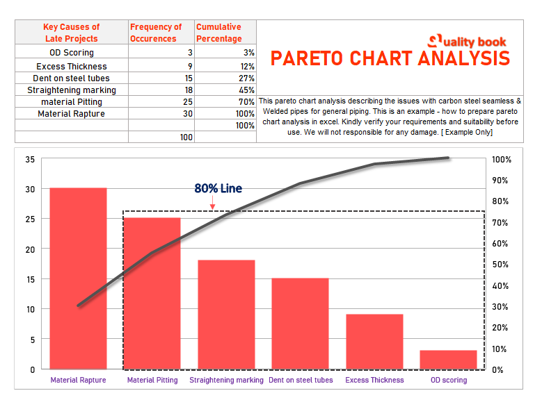
As you can see in above picture, you have to understand and apply the 80/20 Rule for prioritize the issue.
At this point, you can see in above picture there are 80% line with black dot border you can see. This is the 80% issues with multiple issues, and single issue (material rapture) is remain 20% issue which is highest percentage out of all issues.
Outcomes:
» The Pareto chart (See above Image) clearly showing the biggest contributions in percentage of issues in the production line is “Material Rupture” which is about 20% +
» Now engineers enable to setup the target to minimize the issues to focus on single issues and much concentrate.
» These critical part of the issues is 20%, once it is resolve that may helpful to get 80% benefits from entire issue list.
Pareto chart analysis – Excel examples free download
Pareto Chart Analysis Example
This is the simple Excel made Pareto chart analysis example for to addressing the problems to identify proper solution in order to solve it. This ready made template may help you by customize with your own data and information for prepare your own Pareto chart. This Pareto chart analysis works on 80/20 Rule, which is most important to resolve the issues.
Free Pareto chart analysis template
Usually, when you are going to create Pareto chart, first of all you have to organize your data for preparing the chart. Here as you can see with above picture, there are number of defects details are given which are occurring during the production. Even the Details of defects and number of product are rejected during the April 2019. This is example of the Pareto chart for better understanding. As bottom of the image, you can see the Pareto chart with curve which describing the which defect is on priority. When you are identifying the 20% areas of the defects on which you require to focus for resolve. You have to focus and identify the proper solution on it.
Pareto chart analysis excel example
Here as you can see above instant example of the Pareto chart analysis is for Steel tubing manufacturing unit. If any manufacturing unit having the number issues as described in above picture, the example describing how to deal with these issues and how to set priority for the element issues. As 80/20 rule, when you focus on major or 20% issues which are on priority, you may enable to solve remain 80% issues or getting benefits in line with Pareto chart analysis.