An X Bar R chart in Excel is a type of control chart, used to monitor the average and range of a process over time.
So far we have seen information about X bar R chart, what is it?, what is the formula? Etc… But how to make it happen now. So, most businesses create their X bar R charts in Excel, as this method is affordable. Here are detailed instructions on how to create X-bar and R charts in Excel:
Common Steps for creating X Bar R Chart in Excel
Collect and organize information.
First create a new Excel worksheet, then enter the sample number in column A, and enter the product weight information in column B.
Calculate the sample means and ranges
Here, to calculate the sample means and ranges, in column C, we will use the Excel function AVERAGE(range) to calculate the average of each sample. Whereas, in column D, we will use the Excel function MAX(range)-MIN(range) to calculate the range of each sample.
To calculate control limits
For example, we can use the Excel function AVERAGE(RANGE) to calculate the mean of the sample means, in column E. In column F, use the Excel function STDEV(Range) to calculate the standard deviation of the sample mean. At column G, use the Excel function AVERAGE(range) to calculate the mean of the sample range. In column H, use the Excel function STDEV(Range) to calculate the standard deviation of the sample range. Also in column H, use the Excel function STDEV(Range) to calculate the standard deviation of the sample range.
X-bar chart
Here, we will first create an x-bar chart. Select the data in column C and go to the “Insert” tab, select “Line Chart” and then select “Line Chart with Markers”.
R chart.
Select the data in column D, and go to the “Insert” tab, select “Line Chart,” and then select “Line Chart with Markers.”
Add center lines to the chart.
Select the chart and right-click on it, select “Add Trendline” and then select “Linear”.
Add a data label to the chart.
Select the chart, right-click on one of the plotted points and select “Add Data Label”.
Add control limits to the chart.
Go to the “Design” tab and select “Add Chart Element” and then “Error Bar” and select “Custom” and then enter the control limit values in the dialog box that appears.
Interpret the chart.
Use the guidelines for interpreting X-bar and R charts that I have provided in previous answers to analyze the plotted points and control limits to determine whether a process is in control or out of control.
Keep in mind that this is a general guideline, and the steps may vary depending on your version of Excel and the complexity of your data.
Creating X Bar R Chart with Actual Data
Above we have seen how a x bar chart is usually made. But when there is real data, it can be a little difficult to create it, because there are many formulas that need to be used.
Here are some of the short forms used in x-bar charts, which are explained in detail below, along with the information filled in the table below:
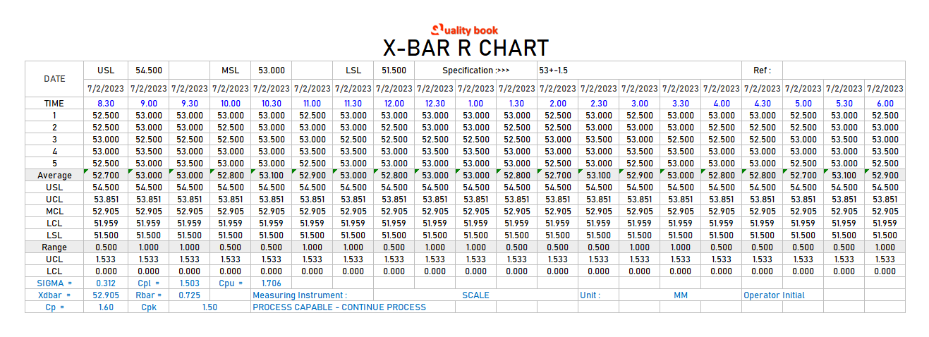
When we are making anything, if we understand the essence of that thing, it becomes easy and excellent to make. So here, the terms used in the X Bar R chart are explained as follows:
X-Bar Chart
Here x-bar charts are used in statistics to represent the sample mean of a group of observations. It is calculated by summing all observations in a group and dividing by the number of observations in the group. A sample mean is an estimate of the mean of a population and is used to make inferences about the population from which the sample was drawn.
UCL (Upper control limit)
Look in the x-bar chart, there you can see the UCL (Upper Control Limit) line. The UCL for that line X-bar refers to the upper limit of the control chart for the sample mean. It is used to monitor the mean of a process over time and to find out if the mean of the process has changed. It is calculated based on the sample size, procedure standard deviation and desired level of confidence. Note that, if the sample mean exceeds the UCL, it indicates that the process mean may have changed and further investigation is needed to determine the cause.
X-Dbar
This is used in statistical process control (SPC) to represent the mean difference between two sample measurements. It is used to monitor process variability over time and to detect whether process variability has increased or decreased. It is calculated for each sample by subtracting the first measurement from the second and then averaging the differences. The D-bar chart is used along with the X-bar chart to monitor process variability. Upper and lower control limits (UCL, LCL) are calculated based on sample size, procedure standard deviation, and desired level of confidence.
LCL (Lower Control Limit)
The LCL (lower control limit) for the X-bar refers to the lower limit of the control chart for the sample mean. It is used to monitor the mean of a process over time and to find out if the mean of the process has changed. It is calculated based on the sample size, procedure standard deviation and desired level of confidence. If the sample mean falls below the LCL, it indicates that the process mean may have changed and further investigation is needed to determine the cause. The LCL-X-bar is used to monitor the process average along with the UCL-X-bar, which is the upper limit of the control chart for the sample average.
R in R-Chart
R in an R-chart stands for the sample range, which is the difference between the largest and smallest value in the sample. It is used to monitor process variability over time and to find out if the process variability has increased or decreased. R-charts are used in
statistical process control (SPC) to monitor process variability. It is designed along with the X-bar chart to monitor the process averages. The upper and lower control limits (UCL, LCL) for the R-chart are calculated based on the sample size, the standard deviation of the procedure and the desired level of confidence. If the R-chart falls outside the control limits, it indicates that the process variability has increased or decreased and further investigation is needed to determine the cause.
UCL (Upper Control Limit) for R Chart
The UCL (upper control limit) for R in an R-chart refers to the upper limit of the control chart for the sample range. It is used to monitor process variability over time and to detect if process variability has increased. It is calculated based on the sample size and desired level of confidence. If the sample range exceeds the UCL, it indicates that process variability has increased and further investigation is needed to determine the cause.
R-bar
The r-bar is a symbol used to represent the range of the sample mean in
statistical process control (SPC). It is a measure of process variability and is used to monitor process variability over time and find out whether process variability has increased or decreased. The R-bar is calculated by averaging a series of all sample measurements taken. R-bar chart is used to monitor process variability along with X-bar chart, upper and lower control limits (UCL, LCL) for R-bar chart are calculated based on sample size, process standard deviation and process standard. Desired level of trust. If the R-bar chart falls outside the control limits, it indicates that the process variability has increased or decreased and further investigation is needed to determine the cause.
LCL (Lower Control Limit) for R Chart
The LCL (lower control limit) for R in an R-chart refers to the lower limit of the control chart for the sample range. It is used to monitor process variability over time and to detect whether process variability has decreased. It is calculated based on the sample size and desired level of confidence. If the sample range falls below the LCL. It indicates that process variability has decreased and further investigation is needed to determine the cause. LCLR is used to monitor process variability along with UCLR (upper control limit for R). Which is the upper limit of a control chart for a sample range. LCLR and UCLR are calculated based on sample size and desired level of confidence and are used to detect changes in process variability over time.
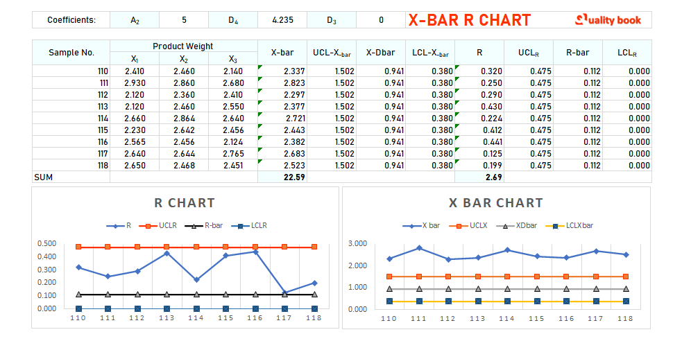
Charts
According to the table given above, here we will create a chart based on the information in the table. According to which x-bar chart and r-bar chart are given below.
How to analyze X bar and R chart?
It is actually a subject of analysis that X-bar and R chart analysis interpret the plotted points and control limits.
To determine whether a process is in control or out of control.
So the information on how to perform this analysis is given below:
- First of all we have to see whether the points plotted inside the chart are in control or not. If so then it is considered that the process is in control. The process means and ranges are stable and consistent, and there are no significant sources of variation.
- Perhaps if the plotted points fall outside the control limits. The understanding is that the process is out of control. And the mean and range are not stable and consistent, and may contain significant sources of variation.
- Here, we have to check the mean chart trend in the plotted points?, and also the pattern. Such as a trend or cyclical pattern, it may indicate that the meaning of the process is changing. If the plotted points on the R chart show a clear pattern. Such as a trend or cyclical pattern, it indicates that the process series is changing.
- A special point is to check the points plotted outside the control limits on both the x-bar and r charts. If there are plotted points outside the control limits on both the X-bar chart and the R chart. It may indicate that there is a problem in the process that needs to be addressed.
- It may also happen that there are points plotted outside the control limits on one chart. But not on another chart, if there are plotted points outside the control limits on the X-bar chart. But not on the R chart, it indicates that the process mean is shifting but the range is stable. If there are plotted points outside the control limits on the R chart but not on the X-bar chart. It indicates that the process range is changing but the mean is constant.
- In such cases we have to identify the cause of the out-of-control situation, and take corrective measures to bring the process back under control.
These are general guidelines and interpretations may vary depending on the specific context and process being observed. It is also important to use correct tables of constants to calculate control limits based on sample size.
zMjBrXaxWgsNpxVgnz
keoMwubiWdKtIdCQMY