In the present manufacturing world, Quality management and its methods undergoing transformation. Through the evolution of total quality management, we see that every department peoples that is top to bottom level people have being involved and its necessary for drastically changed or customer requirements being higher level. So how to achieve good quality product, and how manufacturing processes and related processes should maintained, is there any way to identify and analysis tools to bring the information for it? Yes, quality tools are.
What is 7 quality tools? Seven Basic Tools of quality
7 Quality tools are visual aids makes statistic and quality control more comprehensible and statistical analysis less complicated for quality personnel.
Simply, 7 Basic tools of quality / 7 quality tools are the means for collecting data, analysis collected information, identification of root causes and measuring the results, in short its totally related to numerical data processing.
The simple 7 Quality tools or Statistical tools are:
- Cause and effect diagram: Cause and effect diagram is also called fishbone diagram, it is a tool for determining all the potential causes for an actual effect. The key purpose of this diagram is to performance as a first step in problem solving by building a list of possible causes.
- Check sheet: Check sheet is A structural form to makes it easier to collect data and filling collections. The specific type of structure helps to make the data collection effort more accurate, and support and shorting information, summarization of data which is often very effective for analysis.
- Control Charts: Control charts are used to determine whether a process will produce a product with consistent measurable properties.
- Histogram: A histogram is bar graph, that shows frequency distributions, and provide the easiest way to calculate the scattering of data.
- Pareto Chart: Pareto charts are used to identify and prioritize factors are more significant.
- Scatter Diagram / Scatter chart: Scatter diagrams / Scatter Chart are used to identify the possible relationship between changes observed in two different sets of variables.
- Flow Charts: Flow charts used to identify the actual flow / sequence of events in a process that any product flows. (Alternative Stratification)
Seven Quality tools know as ” 7 QC tools ” are widely used in organization for various purposes to identify problem and setup the priority problems quickly and effective manner related to controlling and assuring quality. The reason behind the popularity of 7 quality tools, provides structured accomplishments that give towards increasing or maintain product quality, and its basic fundamental is succeeding quality improvement. let’s see all seven quality tools in brief:
7 QC TOOLS
[1] Cause and effect diagram (Fishbone Diagram):
The cause and effect diagram (fishbone) is a graphic tool that helps identify, short, and display possible causes of a problem or quality characteristics. The cause and effect diagram is also called the fishbone diagram, because the diagram graphic looks similar to fishbone, it’s simple but very useful tools how we show in this topic. Fishbone or cause and effect diagram is a simple tool for identify all the possible causes for particular effect. The mostly this diagram is to performance as initial phase in problem solving by making a list of possible causes. Let’s see steps by step how to cause and effect diagrams (fishbone works):
- The constructing a cause and effect diagram, its clearly identify and focus on the problem / effect for which causes must be identified. Highlight problem / effect on the title of the diagram.
- It’s important to identify all the boarding part of the problem, and try to describe detailed information of the possible causes in each of the pointed part or board area.
- When any cause identified should be needs to deep observation, looked upon for further specific causes to tracks and monitor location / place / object.
- The diagram able to highlight main cause by review the diagram and evaluate it.
Generally, diagram can be used to detect the problem of the incorrect deliveries see, example diagram as below:

Cause and effect diagram construction:
- Manufacturing: Manpower, Method, Materials, Machine
- Applications / services: Machinery and Equipment, Procedures, Peoples and policies.
Cause and effect diagram advantages:
- Helps to determine root causes.
- The cause and effect diagram show the relationships between an issues / problem and its related possible causes.
- Preparation of the diagram is educational in itself.
- Cause and effect diagrams describe, present and demonstrates information of problem solving team.
- Diagram itself display results in active searches for causes, its needs little review for it.
- In short, roadmap to verify overall picture of the processes.
Making Ideas:
Before the making a fishbone diagram remember that, decide which quality characteristic and its results / outcomes or specific effect you want to inspect, for examine specific effect you may use Pareto Chart. A manufacturing team when going to launch a new product or service, the influences that will affect the finishing products must be recognized. The fishbone chart can represent problem before they have a chance to begin, hence the most manufacturing authority are conduct some basic data and prepare the chart to avoiding such issue.
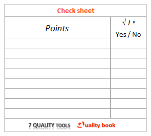
[2] Check sheet:
Check sheets are special types of forms. It is use for collecting data from various departments. The format helps to make it easier to collect data and tend to make the data collection effort mode accurate.
The purpose of check sheets tools for collecting and organizing measurable or counted data. And collect information may use as input data for other quality tools.
Actually check sheet is a fact finding tool use to collect data / information about quality difficulties. Some characteristic check sheet calculations the number of deficiencies by formerly identified classifications.
The next step is to graph the defects per category in appropriate diagram. See example:

(Cross Tabulation Check sheets)
A Check sheet is a structural designed form in advance to allow easy collection and aggregation of data information. By just simply enter some number or check marks on a check sheet, data can be collected to extract necessary information about the point or performed specific observation in an efficient manner, eliminating a possibility of skipping any of the required observation point.
| USAGE | METHOD | RESULTS |
|---|---|---|
| The format used to collect the data and information from specific locations / area, and used when performing a through specific event (inspection, observation, to monitoring purpose) |
| The outcomes are used to ensures collection of required information, allows a through inspecting of all check points, and to identify variation. |
Please refer the table as above for the usage and benefits of the check sheets. It is frequently used in regular manufacturing processes and operations, often not specifically for quality control determination.
[3] Control Charts:
A control chart Is a statistical tool used to examine a process stability, Process variations predict expected product outcome.
The primary purpose of the control chart is to prediction of expected product results, and used to ensure whether a process will produce a product with consistent measureable properties. The manufacturing units are generally use control chart to predict process which are out of control and possible out of specification limits, and the control chart separate manage specific identifiable causes of variation.
When to use a control charts?
- A) Identification and counting the number of defective product in ongoing processes.
- B) To verify expected range of production from the processes as predicting.
- C) Examination of process stability
- D) For analyzing outlines of process variation from any particular causes or groups of causes, it can be common or change causes of variation.
- E) To prevent product measurement variation in ongoing processes.
- F) To verify the process is in its normal state or there are some anomalies.
Why use control charts?
- Differentiate between special causes and common comes (Actually there are two cause of variation (first is Common or change causes of variation, and second is special or assignable causes of variation)
- Monitor process variation over time (Frequently monitoring on processes and its consistent are important to quick identification and isolate variation in ongoing processes.)
- Assess effectiveness of changes (frequent monitoring and review of charts display any particular pattern of change of process variation, the system helps to determine assess effectiveness of changes)
Control chart basic procedure
- >> Setup of appropriate control chart for collected data.
- >> The data points should minimum 20 or more are recommended to accuracy and assurance of trend.
- >> Determine appropriate time period, list the data points in time order, and define the range between each of the consecutive data point (plotting data)
- >> Analyze the data to determine the mean / average of the data point values. Calculate the control limits at least three standard deviations to efficient for setup the scales for your control chart.
- >> Identify upper and lower control limits, plot the data point in time manner.
- >> Review control chart outcome displays, identify “loss of control indications”, highlight the chart to further investigation the cause of deviation to immediate isolation.
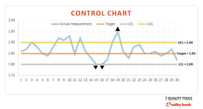
- >> Review the control chart, and observe points which are out of control that is loss of control indicates mean the production lines are failed to maintain target measurement for the particular product, where major three product measurement deviation you can see in above control chart. On Date 15 and 16 points which are down or equal to low control limits same on date 19, point out side of the upper control limits that clear indicates of variations.
[4] Histogram:
A Histogram is a bar graph for graphically portraying a frequency distribution as well as provide the easiest way to evaluate the distribution of data by showing frequency data in structural visual views. The main purpose of the histogram is to determine the spread or variation of a set of data points in a graphic format. In short “Histograms are graphical frequency boards that visually capture and demonstration the variation in a set of data”
When histogram used and what results will be obtained?
- When huge data set in numerical, summarize data sets graphically. Show large volumes of data that are difficult to interpret in common tabular form.
- Displays the comparative frequency of occurrence of the various data values as well as the figure and dimension of the distribution will help identify otherwise unseen sources of variation.
- Compare measurements to specifications.
- Discloses the outline, variation and shape of the data and explains quickly the causal distribution of data. In short its allows you to identify at a glance the variation that exists in a process.
- Outcomes for the histogram i.e. display provides useful information for predicting future performance of the process, and indicate if there had been a change in the process.
- A histogram is generally used to study a manufacturing process by inspecting the situation of the mean standards in the graph or degree of discrepancies, to find a problem point that needs to be improved.
Different between bar graph and histogram
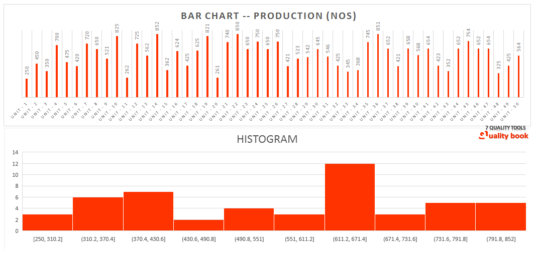
When we creating a histogram, a range of data is divided into smaller sections having a uniform span, as you can see above example picture indicate that production numbers are merged in various category range in uniform, and number of data controlled in each division is calculated to improve a frequency distribution table. Remember that, for the creating a histogram needs to sufficient data point, minimum 50 data points.
[5] Pareto Chart: 7 Quality tools
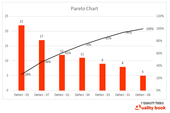
The Pareto charts is a bar graph, used to identify and prioritize problems to be solved. The Pareto chart also called Pareto analysis or Pareto diagram. Actually it is the economic concept that applied for quality problem.
Pareto chart works on basic principle is 80/20 rule. It is states that about 80% of the problems are created by about 20% of the causes. So simple technique is identifying those causes on base of priority displays in Pareto chart. To eliminate or reduce almost all problems. The Pareto chart / Pareto analysis assistance you to concentration your efforts on the problems. That offer the highest potential for improvement. Analysis team can focus on those potential causes that will have the biggest impact if solution made.
Why use a Pareto chart?
- It is breaks potential problems into smaller pieces.
- Through Pareto chart we can Identifies most significant factors from bunch of inconsequential problems set.
- Its helps to Demonstrate us, where to concentration our efforts.
- Outcomes from Pareto chart, helps us to understand how better use of limited resources.
To construct a Pareto chart, the following steps are recommended:
- A. Make an initial list of problem classification mean choose a problem that needs to be addressed. It is very important to decide which problem you want to know more about in deep.
- B. Identify causes of issues based on available data set, and verify the occurrences in each problem grouping.
- C. To be determine how these problem causes monitored, compared and rank ordered for collected information for the Pareto chart in concern of occurrences and cost effective manner.
- D. Decide time frame and select the significant unit of measurement such as frequency or cost.
[6] Scatter Diagram / Scatter chart: 7 Quality tools
Scatter diagram (Scatter Chart) are use to identify and study the possible relationship between the changes observes in two different set of variables.
Mostly the analyst uses the scatter diagram to identify associations. That might exist between a quality characteristic and a factor that might be motivating it.
The diagram shows the relationship between two variables in a process. The scatter chart is generally useful for showing and comparing numbering values like: Statistical and Engineering data.
These diagram / chart are helps to display the relationship between the numeric criteria in several data sequences in to two group of plot of set of numbers. As one series of two different axis coordinates.
Constructing scatter chart / diagram
Collect two pieces of data and create a summary table of the data, determine which paired factors you want to inspect, both factors must be measurable on some incremental linear scale. Identify the highest and lowest value for the variables, draw the vertical and horizontal axes of the graph.
See Example:
In steep pipes manufacturing unit having a new production lines. And want to determine what speed of machine is sufficient or perfect to maintain pipe thickness of steel pipes.
The analyst want to maintain pipe thickness close to 3.11 mm. The analyst collects information from production lines for particular machine with various speed. (Target machine and steel product).
And measuring the thickness of pipe. See below the set of information in scatter chart display:

You can see in above picture indicates relationship between machine speed and steel pipe thickness. Where machine speed between 70 to 90 is perfect for the target thickness of steel pipe. As per standards requirements of steel pipes.
The above example helps to understand the displaying the direction of the relationship will determine. Whether increasing machine speed will increase / decrease the steel pipes’ thickness mean defective parts on speed movement.
[7] Flow Charts (Alternative Stratification): 7 Quality tools
A flow chart is diagram that uses graphic symbols. To depict the nature and flow of the steps in a process. The purpose of the flow chart is to arrange visual illustration of the sequence of process. And operations required a task like graphic drawing of each process to measure. Draw start point for process improvement, identify potential faults in the process are made graphical.
Why use a flow chart and results will be obtained?
It is promoting process understanding that. That may helps manage and identify the real flow or sequences of events in a process that any product flows. Flow charts show what actually happens at each phase in the process. In case of any non-standard events occurred, it is easier through graphically display.

After creating a flow chart, analyze the flow chart details to determine. Which steps add value and which does not in the process of simplifying the manufacturing process flow. And remember that try to make flow chart simple and easy to understand for all level of peoples.
Conclusion:
Peoples are using titles for essential quality tools as 7 Quality tools, seven quality tools or 7 QC tools. Its only mean for collecting data, analyzing data, identifying root causes and measuring the results to solve issues in processes. It’s also call “problem solving tools” for specifically, widely used to improve quality worldwide.
Every problem solving tools are works on similar:
Simple tools for problem analysis is: Why – why analysis, and or 4W & H what, who, where, when, and how…
Because “problem is an undesirable event”.